Recently I was invited to submit a piece of art for the White Bear Center of the Arts (WBCA) grand opening gallery. On of my goals this year was to have art in a gallery. This month I have two pieces! I am so excited about that. For the WBCA I had a hard time choosing because I teach two classes. I run one series on urban sketching and one series on iPad sketching. I decided on this particular piece because it is maybe the first project where I realized this is more than a doodling, or study tool. This iPad sketching isn't a gimmick. This is FINALLY where technology for digital art gets sophisticated enough to become intuitive and simple enough. We have finally crossed the line from early adopters to a true medium with its own strengths and weaknesses and demands a unique approach toward these abilities.
A big difference in this medium is the ability to undo and the ability to use layers (imagine 4-8 pieces of trace paper you can turn on or off, up or down, and rearrange). If you are a person who believes deeply in proportion and how that equates to the minds understanding of beauty, this is a wonderful tool.
This project is also where I developed my approach to most of my iPad art. Meaning I start with my proportional underlay in blue that eventually gets turned off. I do my sketching on a layer on top of that. My shading and sunlight on a layer just below the sketching, and back ground color last and on a separate layer. I teach this method at WBCA in my class, but of course there are a billion other processes and students have blown me away with fresh ideas. However, that is a separate and lengthy blog.
I referenced my blog and an explanation of my process in the art description for this peice, so let's get to it.
The image below is the final product. I drew this almost a year ago but I believe this took me about 2.5 hours. I had been playing with the program for about 2-3 months on and off. I used the iPad app "ArtStudio" and my finger. At this point I had a stylus, but could never find it. What most people miss on digital sketching is the tactile touch and I kind of enjoyed the thought of using your finger to bring this back. Using your finger takes some getting used to, but not as much time as you might think. The super detail is achieved by really zooming in. Plus, at the time, all of the styluses were the size of your finger anyway, so I really didn't see the difference...plus I could never find it when I wanted to sketch anyway. Since then the stylus has gotten smaller and I keep one in my ever present sketch bag along with my pens and water color.
THE PIECE
This is the piece hanging in the gallery. I had "The Lab" in NE Minneapolis print it 20"x20" on a semi gloss fiber rag. At the time I created this the program couldn't print high res enough to do a 20x20 but John with The Lab had a photo shop fractals program that did the trick. You learn something everday! I did a simple frame with no glass. I may apply glass later, but I like the look and figure the gallery is full of people who know not to abuse the print.
I thought it would be fun to display a digital sketch, of a regular pencil, sharpened by hand, that doesn't look much like a digital sketch and drawn by a finger. Also, I am a believer that if you sharpen your pencils this way they last 50 times longer and you get a huge variety of tips to solve what ever you are trying to describe. Pencil sharpeners waste so much in their efficiency and consistency. Plus, they are never around anyway.

THE PROCESS
I am a deep believer in using the golden mean to layout art, buildings, everything. I truly believe a proportional system is a deep secret to beauty. I also believe any system works, our minds search for order and are happy when they find it, even if they don't know how or why. The golden mean is old and my favorite. I have designed building with this ( Two Market Pointe on 494 and France and the parking garage for the University of St Thomas at Grand and Cretin) and people love them. I have design without this system to a collective....hhhmmphh..its ok..Long story short, I am a believer.
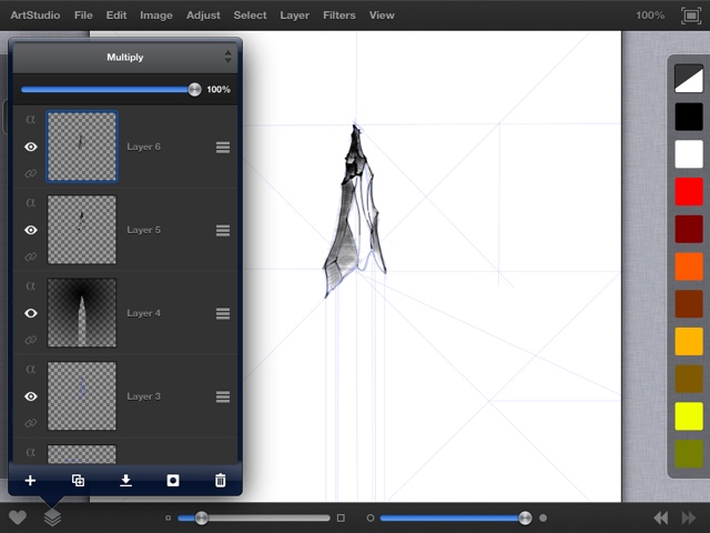
I almost always start digital and real work with literal blued lines or mental subdivisions (after so much practice and positive feedback I have a hard time not doing the subdivision) . This is an example for this project. This is a screen shot showing the program interface and my screen.

From there I start to layout the detail lines. I am not using the proportional system to this level of detail, but I am looking at it while zoomed to to make sure the spaces feel right. The blue lines will eventually be turned off. I sketch in this way until I am ready to commit.
From there I create a new layer and start to lay down the black. I set the line weight to have a heavier start and stop. I also draw with this method using regular pens and pencils. I do this because it is how I draw anyway and also to knock out the over consistency that I am not crazy about in digital art. (unless that is the embraced style and the artist owns it, but too often it looks to artificial for me). Note that the blue lines are still turned on.
On the left you can see my layers of blue lines, pencil, shading and back ground. In this step I am starting to lay in the shading. Note that after printing it large I wish I had left the shading at this point. I still love the image but think this is was more powerful. Just like water color, it is easy to go a few steps too far. Unlike water color I could go back into the program and fix this (but I would still need to repay to reprint, but not to repost :) )
Without the screen shot of the program and process this is the semi shaded progress shot. I took progress shots because (I love progress shots and ) I thought it might be fun to teach this someday.

Final Shading with the proportional lines layer still on.

From here I started playing with a the gradients I might use. You have a lot of options and I thought a radial gradient at the point of the pencil would be a great start. Note that since this is on a separate layer I can play with a lot of options and not commit. However I wanted to set the background so I could decide on the tonality of the rest of the shading.

This shot is before any color is added and I have started to shade the body of the pencil. There are a lot of brushes and pencil options. Straight line, as if with a ruler and free hand as well. Also fuzzy painterly effects and crosshatching too. You can control all of this, or just use the defaults which are typically all you need. There are a ton of customizing options and you can go as far down that rabbit hole as you care to go. As long as you don't get lost and keep an eye on the big picture it is ok. If you are the type person who can't, just leave the options alone and use the great default options with minimal tweaking. I try to emphasize this in my class, but some people just have the push the buttons if they are there! (You do learn a lot that way, but sometimes the hard way)

I have worked primarily in black and white to this point, but have decided the background could use some color. I use the same gradient, but a blue that I love and that will let the pencil stay "forward"

I debated about this last move of the smoke a lot. I wanted the piece to have some meaning beyond the literal. I also thought it looked a ton like a smokestack once I put the blue in. So I saved it both ways and over time have come to love the smokestack industrial pencil. Smoke is simply a pencil tool using white and really ramping up the "jitter" command available for that tool.
THE FINAL PIECE AS HUNG IN THE GALLERY
When you are drawing on the back lit iPad screen you can draw in the dark while (sort of ) watching TV with the rest of your family. This is so mobile with no clean up I have also done art on planes, in bars while traveling alone, anywhere. All of the art supplies are free as long as you have the $500 piece of paper (the iPad itself - drumroll please)
I really hope you enjoyed this and maybe learned something. I did this sketch over a year ago and it was really nice to revisit it.
Keep drawing!
James Nutt, AIA